Optimizing Web & Brand Strategy for Growth
Envirolite's brand was fragmented across channels, inconsistent visually, outdated on the web, and lacking the credibility their products deserved. I was brought in as an in-house designer to unify the entire brand experience, applying marketing, UX, and product design thinking across Shopify, social, and beyond.
ScopeUX/UI · Shopify Dev · Brand · Photography
companyEnvirolite · Troy, Michigan
toolsFigma · Illustrator · Photoshop · Shopify


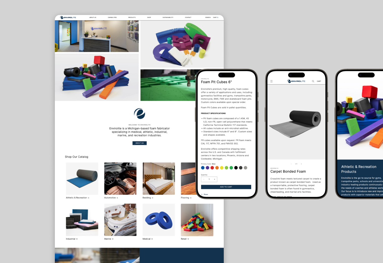
Envirolite Website & Social Media Before
01 - The ProblemA brand held back by its own presence
Inconsistent brand identity
The brand lacked consistency and a clearly established identity. No defined guidelines resulted in mismatched typography, inconsistent color usage, and a web presence that failed to build trust. Inconsistency was costing them credibility.
Poor usability & trust
The existing website lacked usability and failed to establish a strong, trust-building brand presence. The Envirolite website led them to another purchasing platform, which easily could've led to missed conversions.
Low-quality photography
The low resolution of the photography significantly undermined the credibility of the brand. Clear, high-quality images are essential for presenting products effectively and establishing trust with potential customers.
02 — Before & AfterFrom outdated to conversion-ready
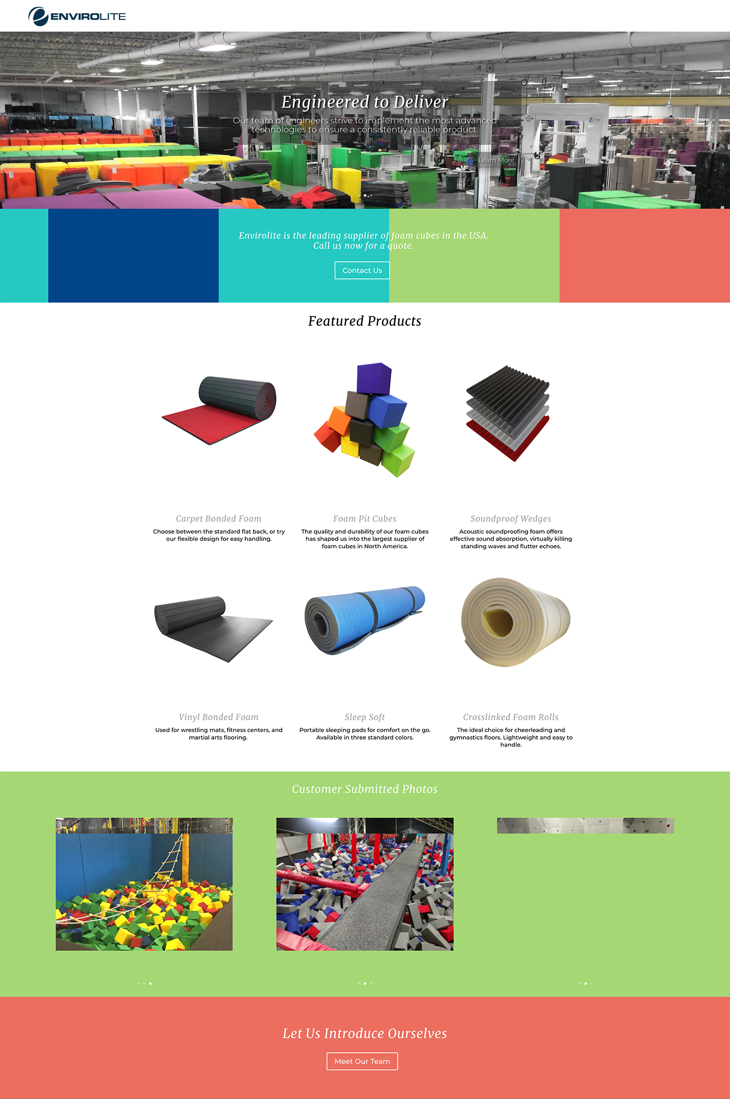
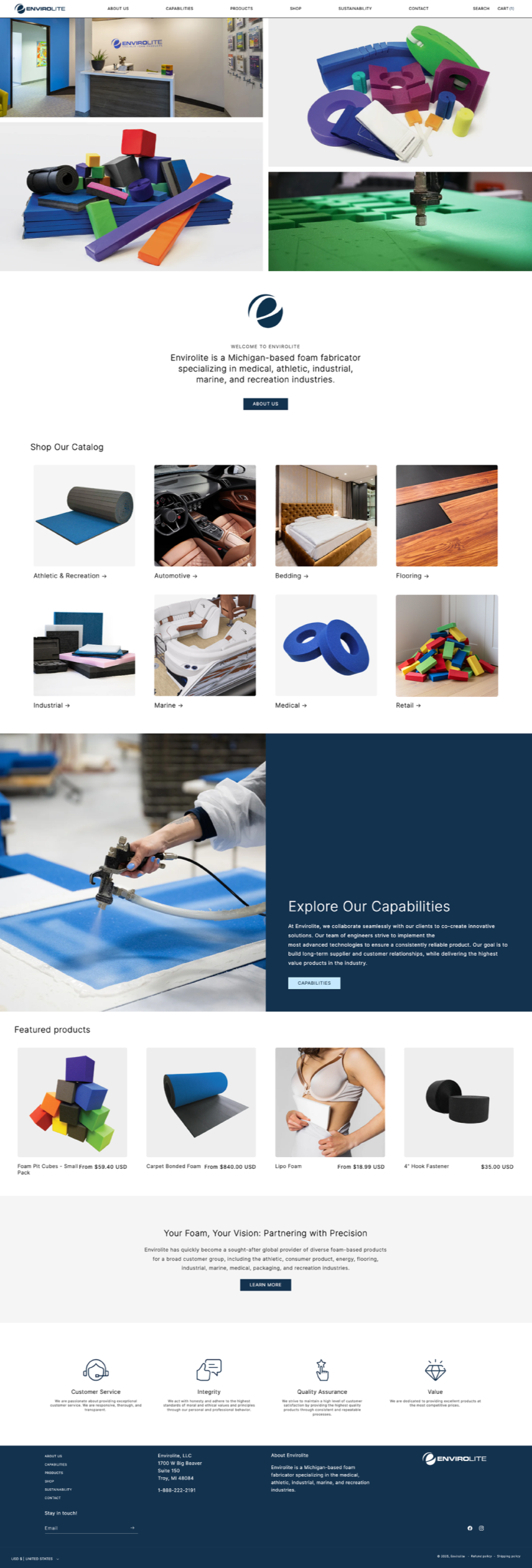
The old Envirolite site was informational at best, a brochure masquerading as a web presence. Every call to action led to a dead end: "Learn More." There was limited products, no path to purchase, and no clear signal that Envirolite was a company you could actually buy from. For a B2B buyer landing on the site for the first time, the experience likely raised more questions than it answered.
The redesign started with a fundamental shift in intent, from informational to transactional. I built out a full information architecture from scratch, organizing products into clearly defined, industry-specific collections so buyers could immediately find what was relevant to their work. Whether a customer was in gymnastics, medical, or automotive, the navigation guided them to the right products without friction.
The most dramatic improvement was the addition of e-commerce itself. Going from zero shoppability to fully browsable, purchasable collections changed the entire nature of what the site could do for the business. Paired with a cleaner visual hierarchy, stronger product photography, and CTAs that actually led somewhere, the redesign transformed the site from a passive marketing tool into an active revenue channel.
03 - OutcomeResults that validated the approach
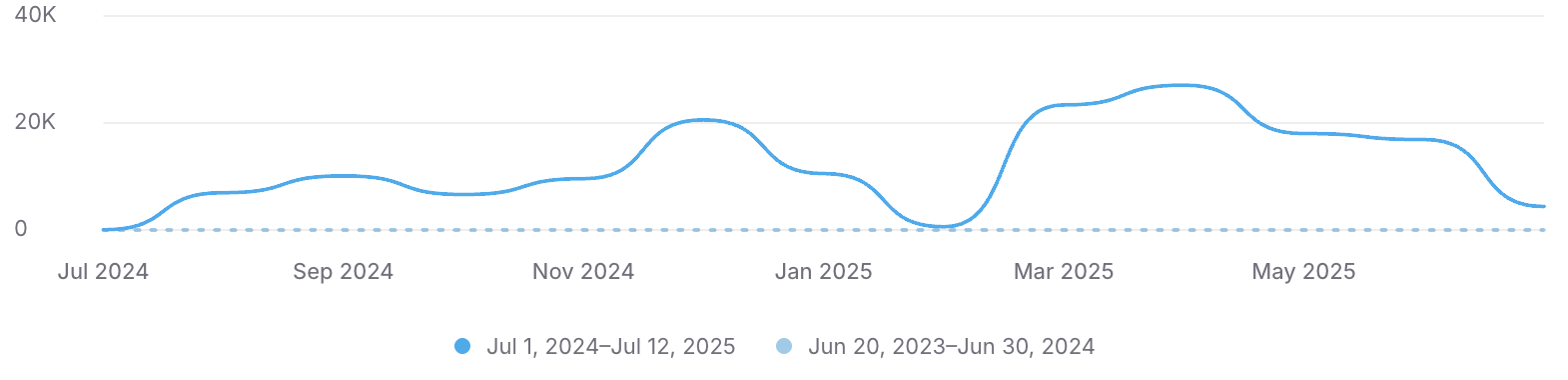
Designed and developed a Shopify store optimized for user engagement, resulting in 104.61% (+$76,436) growth in web sales within the first year.
04 — UX DecisionsDesigning for the B2B buyer
Envirolite's primary customers are gymnastics facilities and medical practices, professional buyers who know exactly what they need and are evaluating vendors on credibility, product specs, and ease of ordering. Before the redesign, the only way to place an order was to call.
That insight shaped everything. The goal wasn't to create a flashy consumer experience, it was to give a professional buyer enough information and confidence to commit without picking up the phone.
Every page needed to clearly answer three questions
What is this product
Is this company trustworthy
How do I purchase
That meant prioritizing product specifications, clean photography, and industry-specific collections so a gymnastics facility manager or a medical procurement buyer could navigate directly to what was relevant to them and check out without friction.
Information architecture for a complex product catalog
75+ Products · 800+ Variations · 8 Industry collections
Mobile-first for on-site buyers
I assumed most sessions would come from desktop, B2B buyers typically order from a work computer. That assumption held up: 58% of sessions are on desktop. But with 42% on mobile, I designed for the smaller screen first and scaled up. Designing for mobile first meant better SEO, better accessibility, and a baseline experience that scaled cleanly to desktop.
Trust signals for a new audience
Professional buyers need to know one thing "can I trust this company?". I tackled this with new product photography, Judge.me Reviews app to collect and display verified customer reviews, and clear CTAs that replaced the old site's dead-end "Learn More" links. Together these gave first-time visitors enough confidence to place an order without picking up the phone.
05 — Wireframes & ProcessProcess before pixels
I started directly in Figma rather than paper sketches, a deliberate choice based on the audience. Leadership had difficulty conceptualizing direction from low-fidelity wireframes or static mockups, so getting to something interactive early was essential for alignment.
Starting in Figma also had a secondary benefit, it let me build the design system in parallel with the layout work. Rather than designing screens and extracting styles later, I was establishing color tokens, typography, and component patterns as I went. By the time the wireframes were approved, the foundation for the full build was already in place.


Mobile Responsive Designs
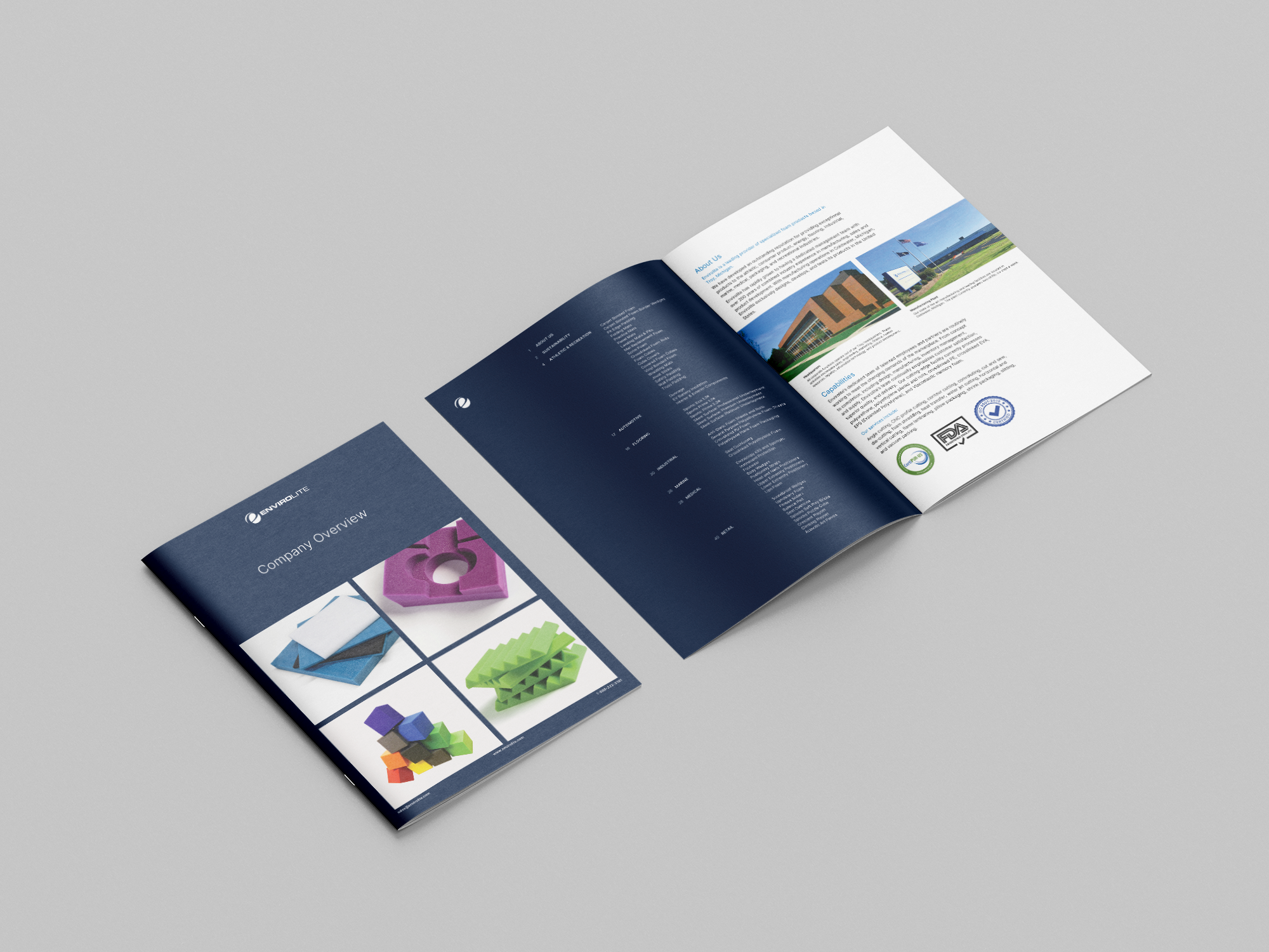
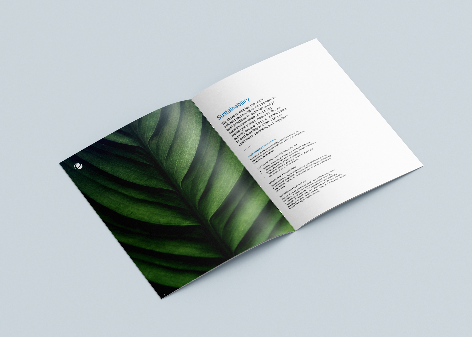
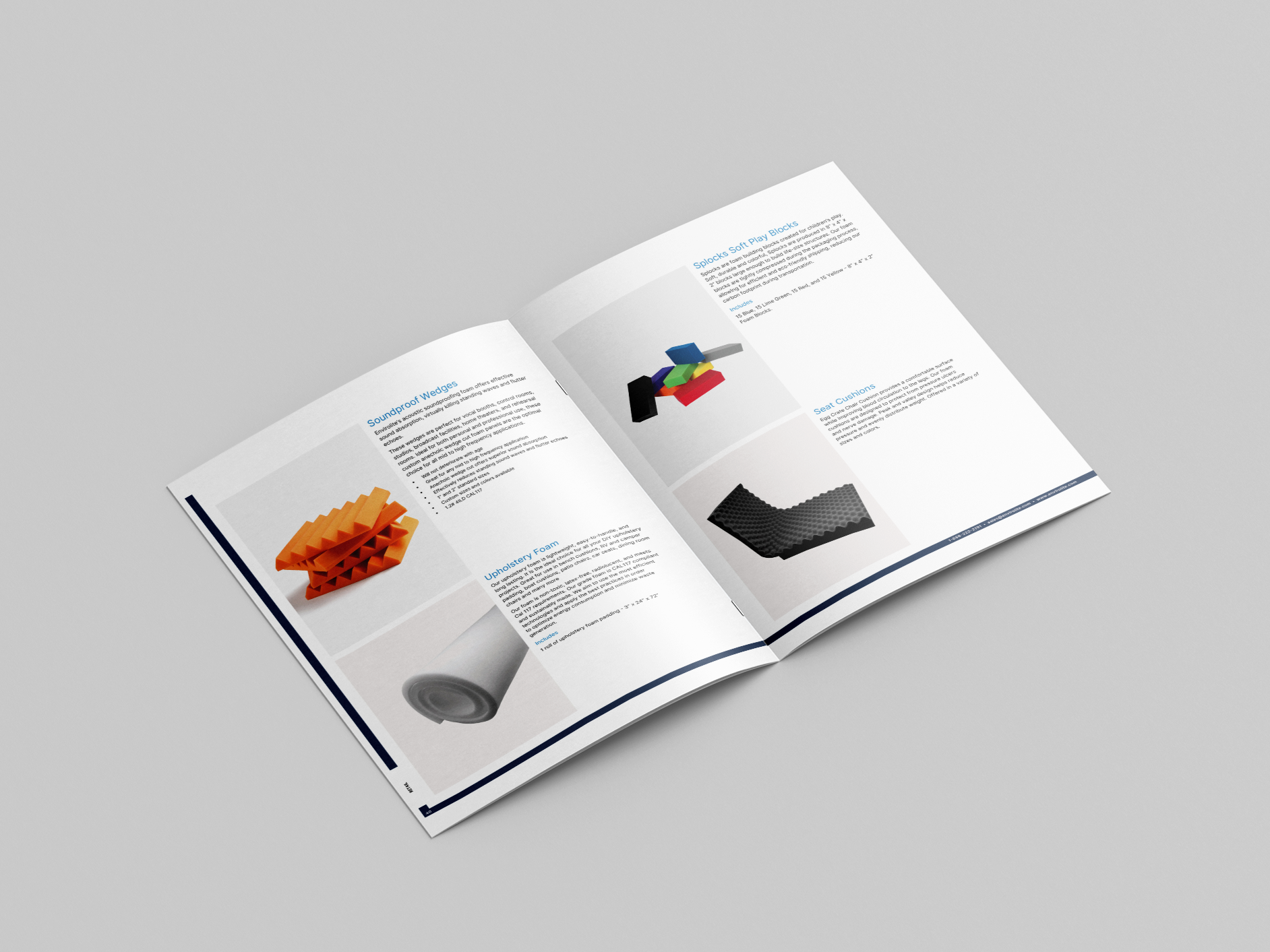
Company Brochure Design

Social Media Graphics & Marketing
We updated the social media channels to showcase a more professional and consistent graphics. This enhancement aims to strengthen the visual identity and improve engagement with their audience. The new look reflects their commitment to quality and professionalism, aligning with their overall brand strategy.


