
Caesars UI & Design System
2020-2023
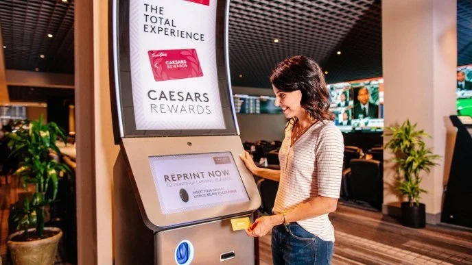
At Everi, I designed reward and wayfinding kiosk interfaces, for multiple casino properties. By the end of my tenure, I led end-to-end design initiatives for Caesars Resorts (50+ global properties), directing client communication and managing development handoff to engineering teams.
I spearheaded the transition from Photoshop to Adobe XD, modernizing the UI prototyping workflow and maximizing our existing Adobe Creative Cloud enterprise investment to keep tooling costs low.
From there I implemented design systems and reusable component libraries, enabling rapid layout adaptation across properties while maintaining a consistent and scalable user experience.
scope of work
• UI Design
• Direct Client Communication
• Design System Development & Implementation
• Photoshop to Adobe XD Migration
The Impact
If I Were Building This Today in Figma
This project predates Figma variables, which means a lot of what I was doing manually (maintaining color consistency, managing spacing values, adapting layouts across screen sizes) would be significantly more efficient today. The approach would be the same at its core: tokens first, components second, patterns third. But the tooling would change everything.
Today's Figma toolset would make that same foundation significantly more scalable, maintainable, and developer-friendly.


Building a Scalable Design System
When I first proposed migrating from Photoshop to Adobe XD, I knew it would be a large undertaking. Rather than overhauling everything at once, I took an incremental approach, each time a property came to us for updates, I used it as an opportunity to migrate that work into the new tool. This meant the system grew organically alongside real project needs, rather than as a separate initiative running in parallel.
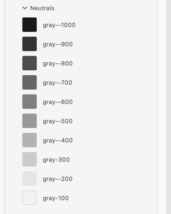
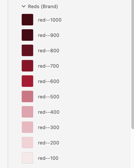
Color Foundation
The foundation started with color. I established a naming scale from 100 to 1000+, intentionally leaving room for the system to grow. If a lighter red was ever needed down the line, we could slot in a red-50 without breaking the existing architecture.
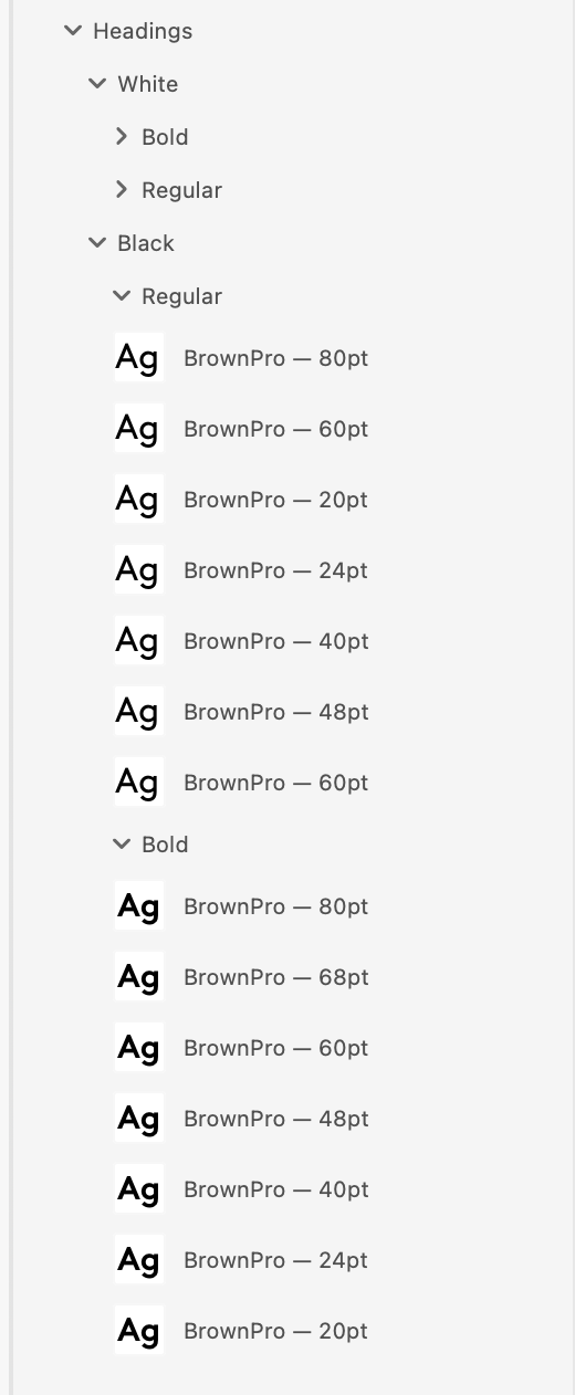
Typography
With color established, I moved on to typography. Caesars uses Brown Pro as their brand typeface, and the goal was to define a clear, consistent scale that worked across the demands of a large touchscreen kiosk environment, from bold hero headlines down to fine print disclaimers.
I anchored the scale to the 8pt grid, meaning every font size is a multiple of 8. This keeps the type system consistent with the broader spacing system and makes implementation straightforward for developers, no arbitrary values.
The reason this works so well in practice comes down to how screens are built. The majority of popular screen sizes (phones, tablets, kiosks) are divisible by 8, which means elements sized and spaced on this grid sit cleanly on nearly any display without rounding errors or misalignment. Designing in multiples of 8 is essentially designing in the native language of most devices.
The scale starts at 80pt for large display moments and welcome screens, where the user needs to read information at a distance in a loud, bright casino environment. From there it steps down incrementally, covering headlines, subheadings, body copy, labels, captions, and button text.
Button Components
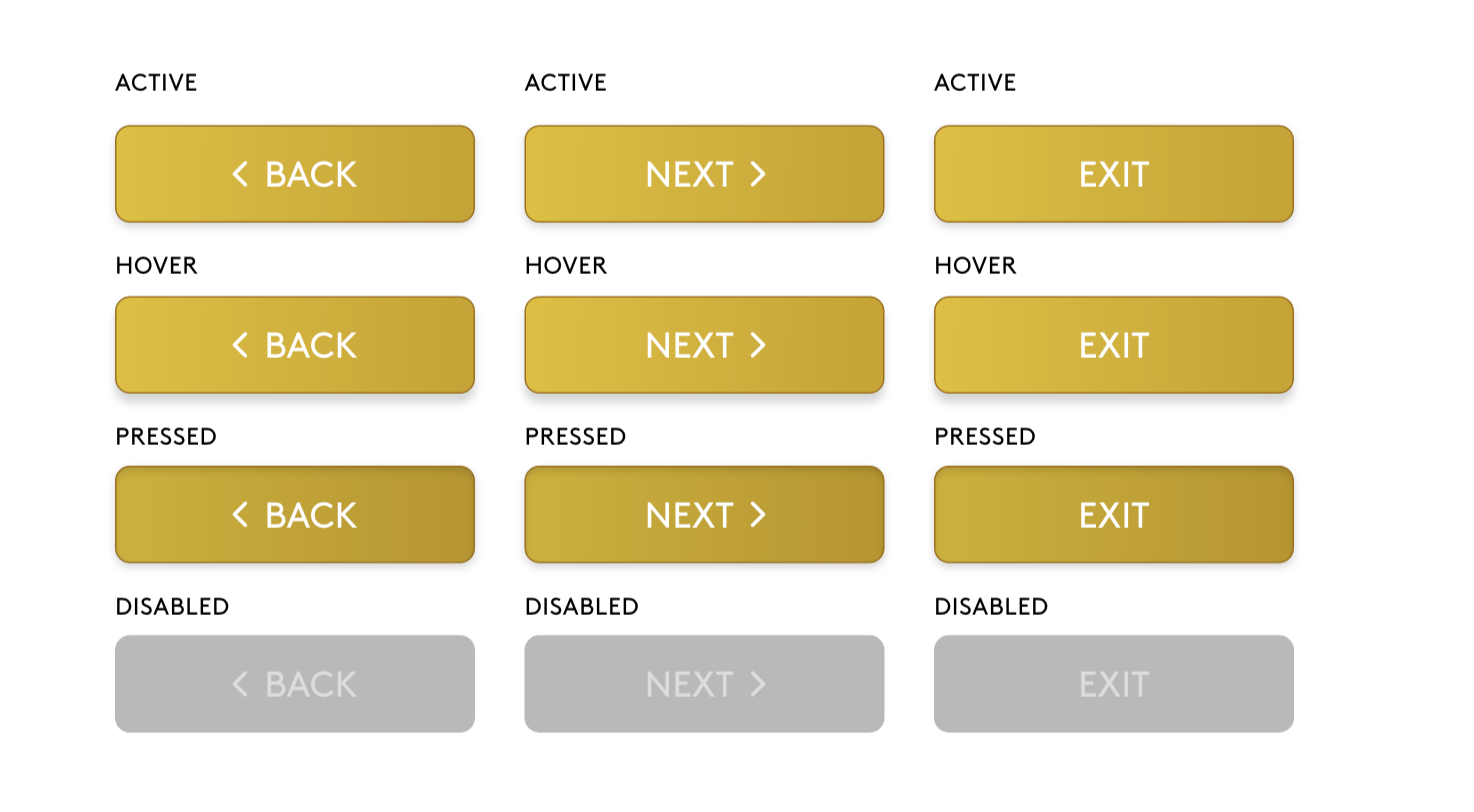
With the color and type foundations in place, I moved on to building out the button components. Kiosk interactions are fundamentally different from mobile. Users are standing, often in a loud and visually busy casino environment, tapping a large public screen with a finger rather than a thumb. Because of this, I set a minimum button height of 64pt across the board, well above the standard 44pt minimum recommended for mobile. This reduces mis-taps and gives users confidence when navigating through a transaction.
Each button was built with four states: active, hover, pressed, and disabled. The active state is the default, full-color gold. Hover introduces a subtle shadow to signal interactivity. Pressed flattens that shadow to give tactile feedback on touch. Disabled strips the color entirely to a muted gray, clearly communicating to the user that an action isn't available without requiring any additional explanation.
Building these as components was an essential part of the process. If a brand ever needed to update their kiosk design, changes could be made at the component level and cascade through the entire system automatically, no hunting down individual instances across dozens of screens.
It also meant that reskinning interface files for new properties down the pipeline became significantly faster and more predictable. What previously required rebuilding screens from scratch in Photoshop could now be handled by swapping tokens and updating a component in one place.
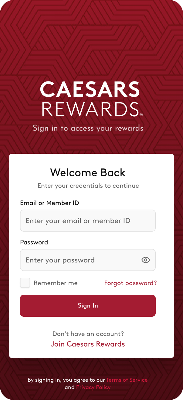
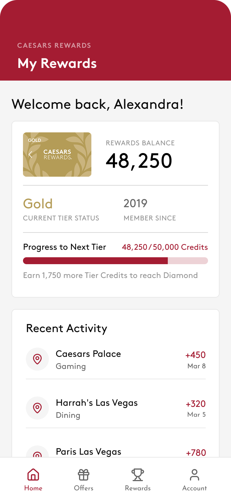
Caesars Rewards
Kiosk Design System
Brand-true design tokens, components, and specs for rewards kiosk experiences.
System Overview & Rationale
This design system encodes the complete visual language of Caesars Rewards, from the smallest token to full screen patterns, so that every surface a member touches feels like the same brand.
Token Architecture
Every visual value traces back to a named token. Instead of writing #A41C32 across 40 components, you write var(--red) once and reference it everywhere. Changing the brand palette becomes a single-file edit.
Atomic Design Approach
The system was built bottom-up. Rather than designing screens and extracting styles later, tokens came first. Every component and pattern above inherits from the layer below.
Design Tokens
The raw values of the design language. Every color, typeface, spacing unit, and shadow lives here as a named variable. Changing a token cascades automatically to everything that references it.
Components
Reusable UI building blocks composed from tokens. Buttons, inputs, cards, badges, and progress bars. Each component consumes token values only, no raw hex values or magic numbers.
Screen Patterns
Full compositions that assemble components into complete experiences. The Kiosk Home, Sign In, Rewards Balance, and Dashboard screens are organisms built from components, never starting from scratch.
Multi-Platform Strategy
Kiosk and mobile share the same token foundation, but the component rules change based on context, distance, and stakes. This is the core systems challenge — and directly parallels in-vehicle vs. mobile design.
Rewards Kiosk
iOS Mobile App
Key Design Decisions
Design systems work is as much about rationale as craft. Every decision below can be articulated to engineers, PMs, and stakeholders.
Token-first over component-first
Starting with tokens instead of jumping to components means the entire visual language is defined before any UI element is built. This prevents color and spacing inconsistencies from creeping in during component work, and makes future brand updates a single-file change rather than a system-wide find-and-replace.
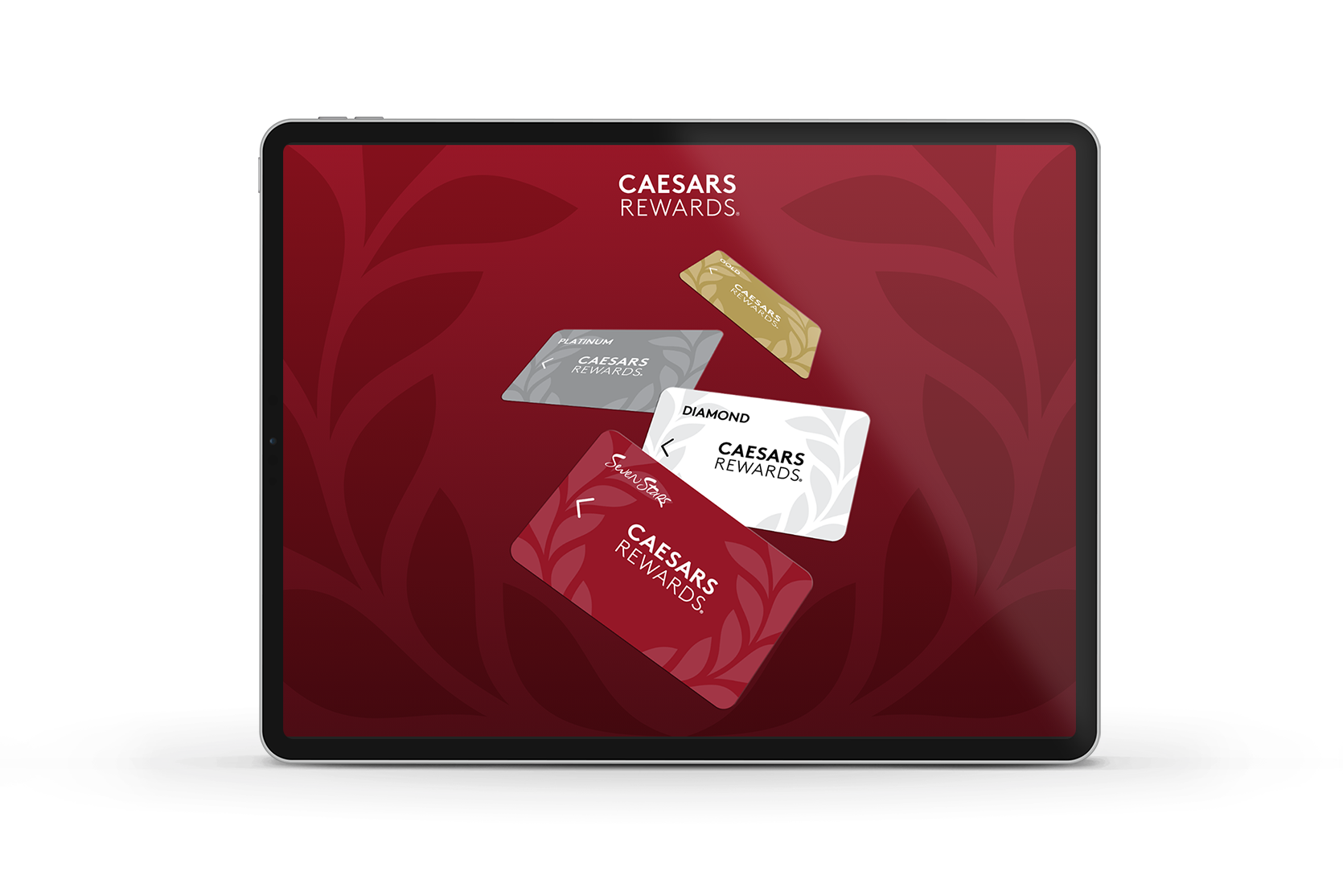
Separate tier token layer for loyalty status colors
Caesars has six membership tiers each with distinct visual identities. Encoding these as their own token layer (--tier-gold, --tier-diamond, etc.) means tier-specific UI — badges, progress bars, card accents — references semantic names rather than hardcoded values. Tier rules can change independently of the brand palette.
Kiosk touch targets set at 64px minimum — not iOS 44pt
iOS HIG specifies 44×44pt minimums for mobile. Kiosks are used with fingers on large screens in noisy, distracted environments. Raising the minimum to 64px and the ideal to 80px (16pt gap between all targets) reduces mis-taps that frustrate users mid-transaction. Platform context defines the constraint, not the platform default.
SVG icons use literal hex values, not CSS custom properties
CSS custom properties (var(--red)) do not resolve inside SVG presentation attributes (stroke="var(--red)"). Using literal hex values in SVG markup while reserving CSS variables for layout prevents silent rendering failures across browsers. Knowing the token system's limits is as important as knowing how it works.
8pt spacing grid — no arbitrary values
Every spacing value in this system is a multiple of 4px, defined as a named token (--s2 through --s20). This forces consistency in padding and layout decisions, creates visual rhythm across components, and aligns with the standard grid conventions used by iOS, Android, and most web frameworks — making engineer implementation faster and more predictable.
Color System
Brand Core
Red Scale
Gold Scale · Rewards & Premium Moments
Surfaces
Membership Tiers
Typography — Brown Pro
| Role | Sample | Size / Weight | Leading | Use on Kiosk |
|---|---|---|---|---|
| 48,250 | ||||
| Welcome back, Melissa | ||||
| Your Rewards Summary | ||||
| Diamond Membership | ||||
| Upcoming Promotions | ||||
| Your credits never expire as long as you visit at least once a year. | ||||
| Earn credits at all Caesars Entertainment properties. | ||||
| Valid through March 31, 2026 · Terms apply | ||||
| Reward Credits · Member Since 2019 |
8pt Grid & Spacing
Border Radius
Button System
Variants
Kiosk Sizes
Shape & States
Iconography
Kiosk Icon Sizes
Kiosk Components
Rewards Balance Card
Kiosk List Rows
Toasts & Notifications
PIN Entry · Numpad
Text Inputs
Accessibility
Contrast Ratios
Kiosk Touch Targets
Kiosk compliant ✓
.contentShape(Rectangle()) to expand hit areas beyond visual bounds in SwiftUI.
VoiceOver & Display
accessibilityLabel. Reward credit amounts use accessibilityValue. Use .accessibilityElement(children: .combine) for balance card rows. Support Increase Contrast via UIAccessibility .isDarkerSystemColorsEnabled. Never convey tier status through color alone — always pair with text label. Kiosk brightness should be ≥ 400 nits in ambient environments.