The Autonomous College Commute, Reimagined
Designing a shared mobility platform that turns the ride to campus into a social experience for college students.
ScopeConceptualization · Research · Interface Design · User Testing
timelineOngoing · 2026
toolsFigma · OpenAI
Transportation is transactional & isolating. It doesn't have to be.
Limited access to convenient, safe, and affordable transportation can prevent college students from attending social activities, making it harder to connect with peers and feel part of their campus community.
Existing ride-share services move people from A to B. They rarely address the social experience. Students, especially freshmen and those living off campus, expressed feeling isolated during the very moments meant to bring them together.
"Design an affordable shared mobility experience that helps college students feel connected, included, and part of a community?"


Learning from students,
not assumptions.
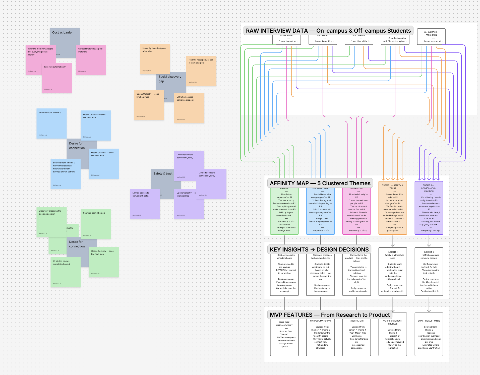
Before defining a solution, I conducted interviews with three college students, both on and off campus, to understand how they navigate transportation during social outings.
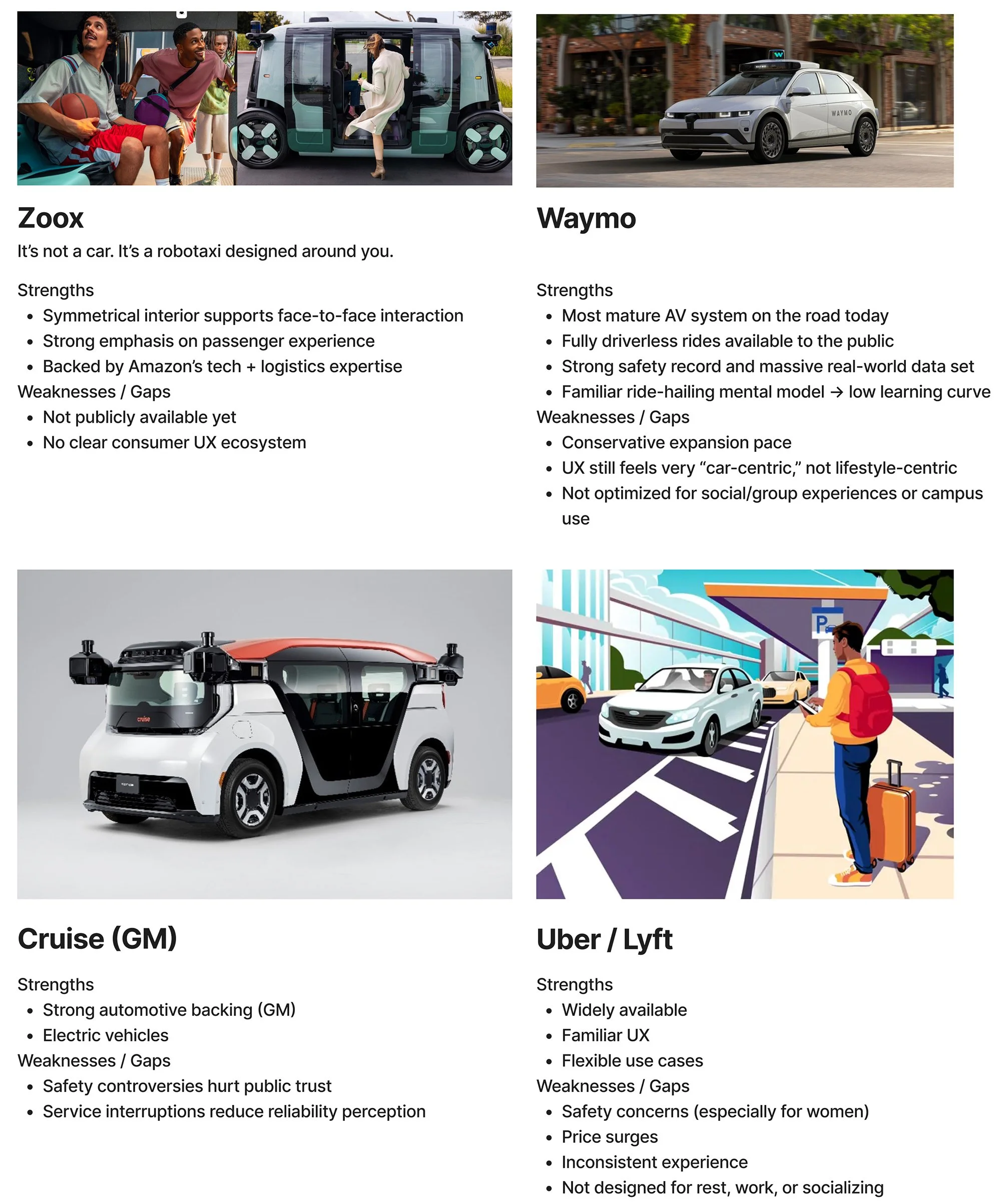
I benchmarked existing ridesharing apps and autonomous robotaxi services to understand common booking patterns, navigation structures, and trust signals. After gathering insights, I synthesized research into key themes and mapped user journeys to visualize how students plan, coordinate, and experience getting around at night.
Three themes emerged from research.
After affinity clustering, three patterns rose clearly to the surface, each pointing to the same gap: existing transportation does nothing to support the social experience around it.
Safety uncertainty drives avoidance
Students, especially women and first-years, avoided late-night rides or relied on friends because they couldn't trust who they'd be sharing a car with. Anonymity felt like a risk, not a feature.
"I just don't feel comfortable getting in a car with random people. I'd rather wait."
Rides feel isolating & transactional
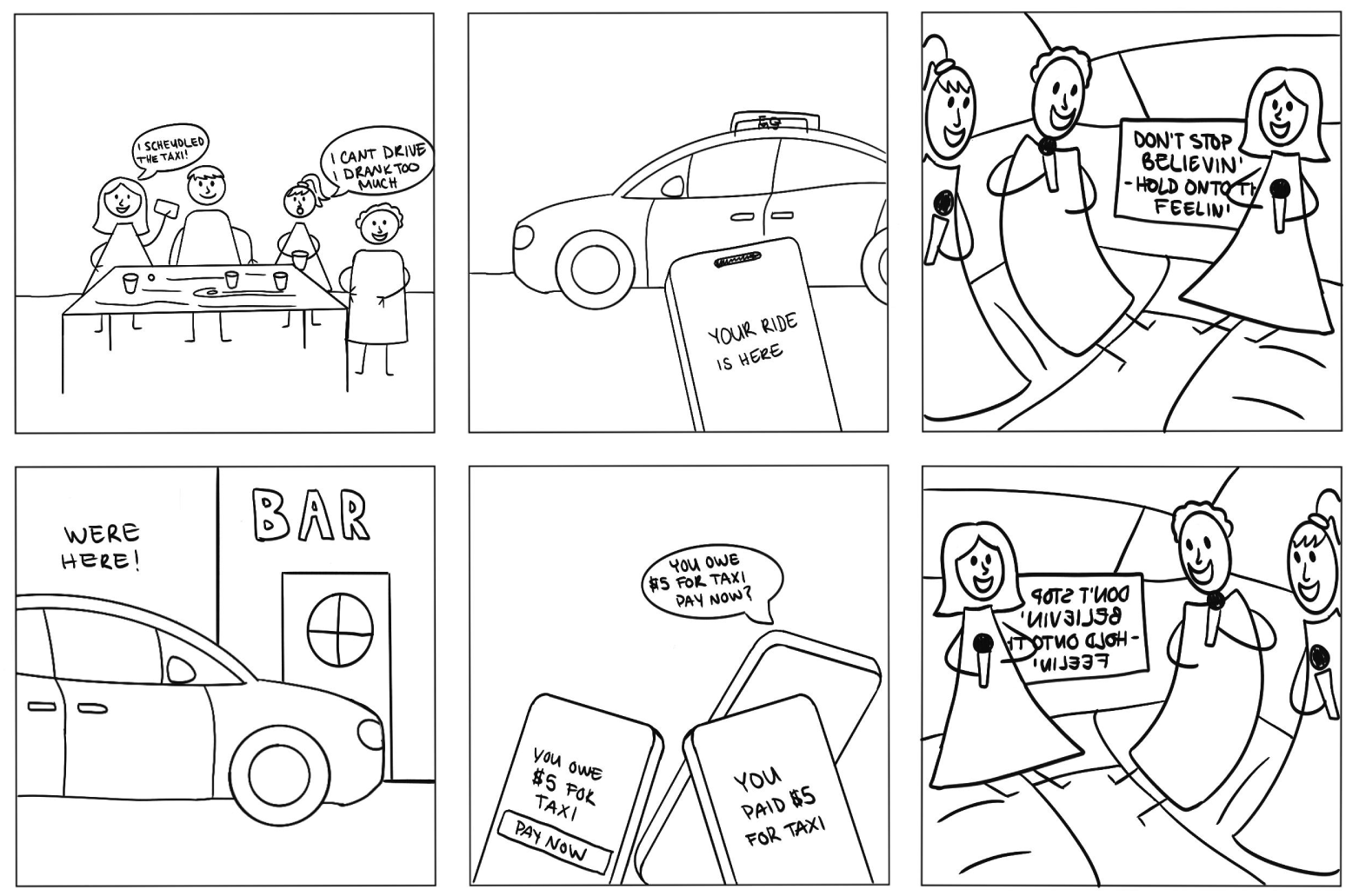
Students described existing rideshare as something to endure, not enjoy. The ride was dead time, no connection, no context, nothing tying it to the social outing it was meant to support.
"It's just you sitting in the back in silence. There's no reason to talk to anyone."
Students want to coordinate, not just commute
Students wanted to see where others were going and naturally ride with people heading the same way, especially to popular destinations.
"I wish I could just see who else is going out and where. It would make it so much easier to not go alone."
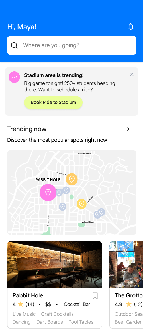
03 - The DiscoveryConnection is missing
from transportation
My research revealed that transportation for students is often transactional and isolating. While ride-share services effectively move people from point A to point B, they rarely address the social experience. Many students expressed a desire to feel more connected and safe while traveling, especially during nights out.
This insight revealed an opportunity to rethink mobility, not just as transportation, but as a shared social experience.
Primary User
The Core Problem
Limited access to convenient, safe, and affordable transportation can prevent college students from easily attending social activities, making it harder to connect with peers and feel part of their campus community.
MVP features, chosen by evidence.
From the prioritization matrix, I identified the core features needed for the minimum viable product, balancing user desire, technical feasibility, and impact on community connection.

Automatically connect students heading the same direction at the same time.
Choose who you ride with: year, major, interests to create meaningful connections.
No awkward Venmo requests. Fare splits in-app the moment the ride ends.
Campus email verification builds trust and keeps the community safe.
Optimized pickup locations reduce wait times and improve logistics.
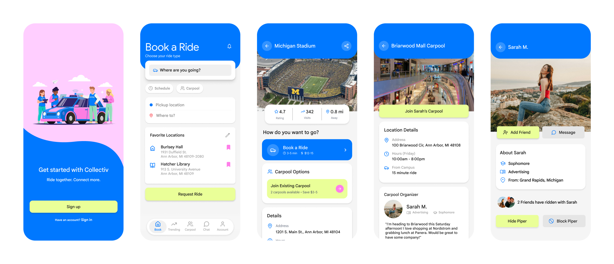
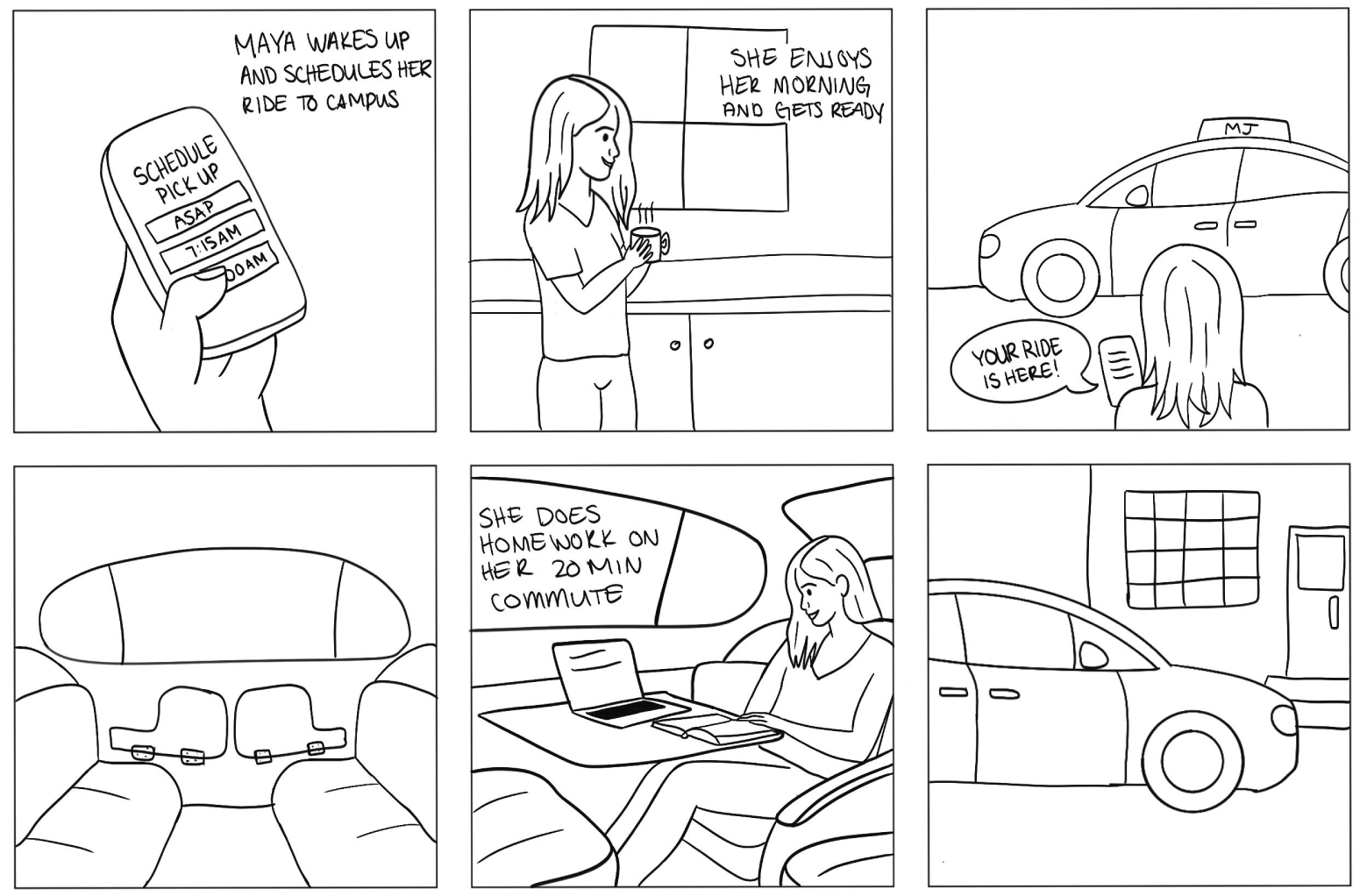
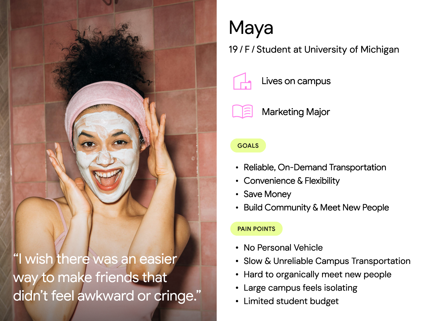
Maya's first Friday night out.
To ground the concept in a real human story, I created a storyboard following Maya, a first-year student navigating her first social outing. The narrative shows how Collectiv transforms an anxious, isolating commute into a confident, connected evening.

It's Maya's first weekend in the dorms. She and her roommate want to go out, but feel disconnected from the rest of the students.

Maya opens Collectiv and sees a live heat map showing where students are heading tonight.
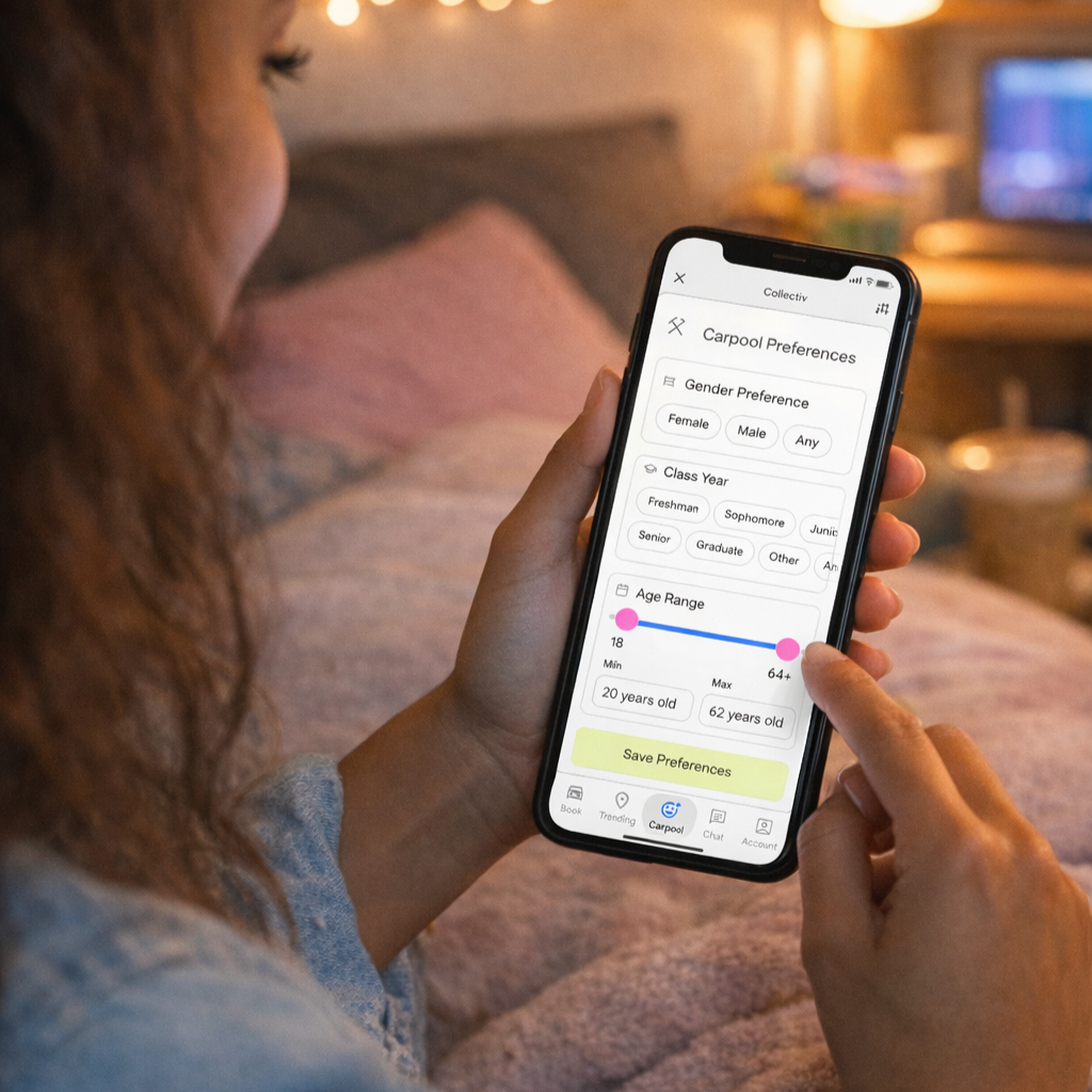
She books a carpool and applies filters to choose the types of students she'd like to ride with.
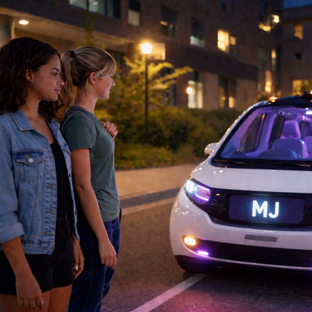
The autonomous vehicle arrives at the dorm entrance and Maya boards with her roommate.
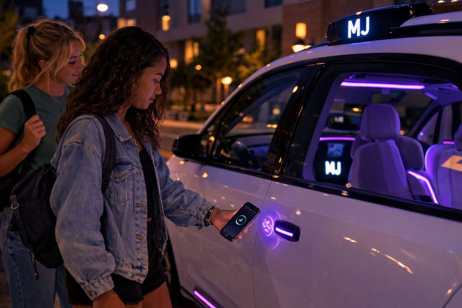
Maya uses the app to unlock the car — a built-in safety feature giving students full control.
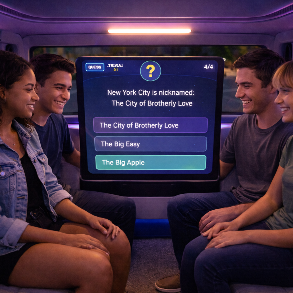
The students play trivia to break the ice, what could have been an awkward ride becomes a game.
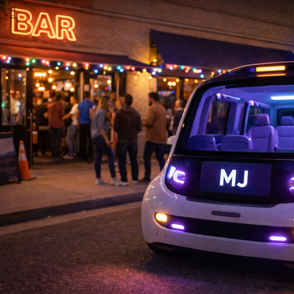
The AV drops them off at the bar, four strangers, now a group.
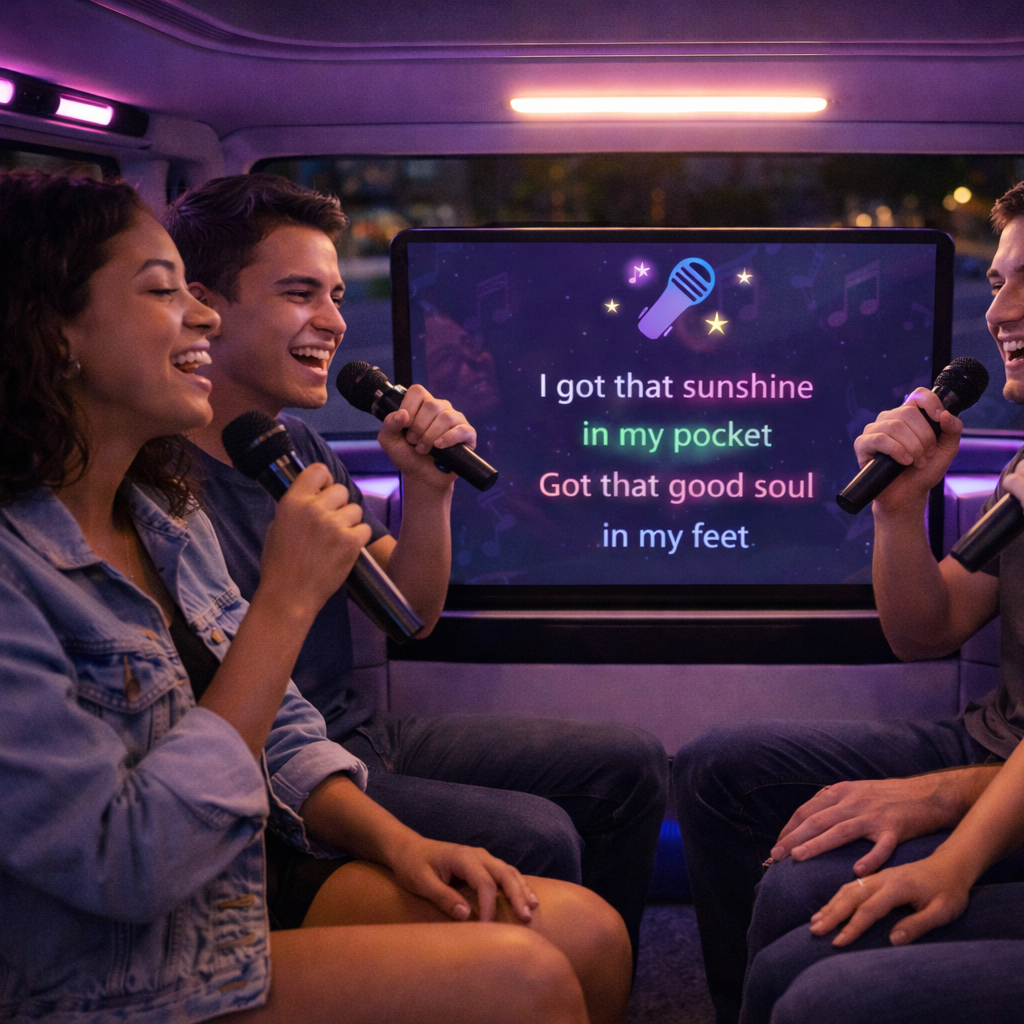
At the end of the night, they reconnect on the app and hop in a ride home, an impromptu karaoke session.
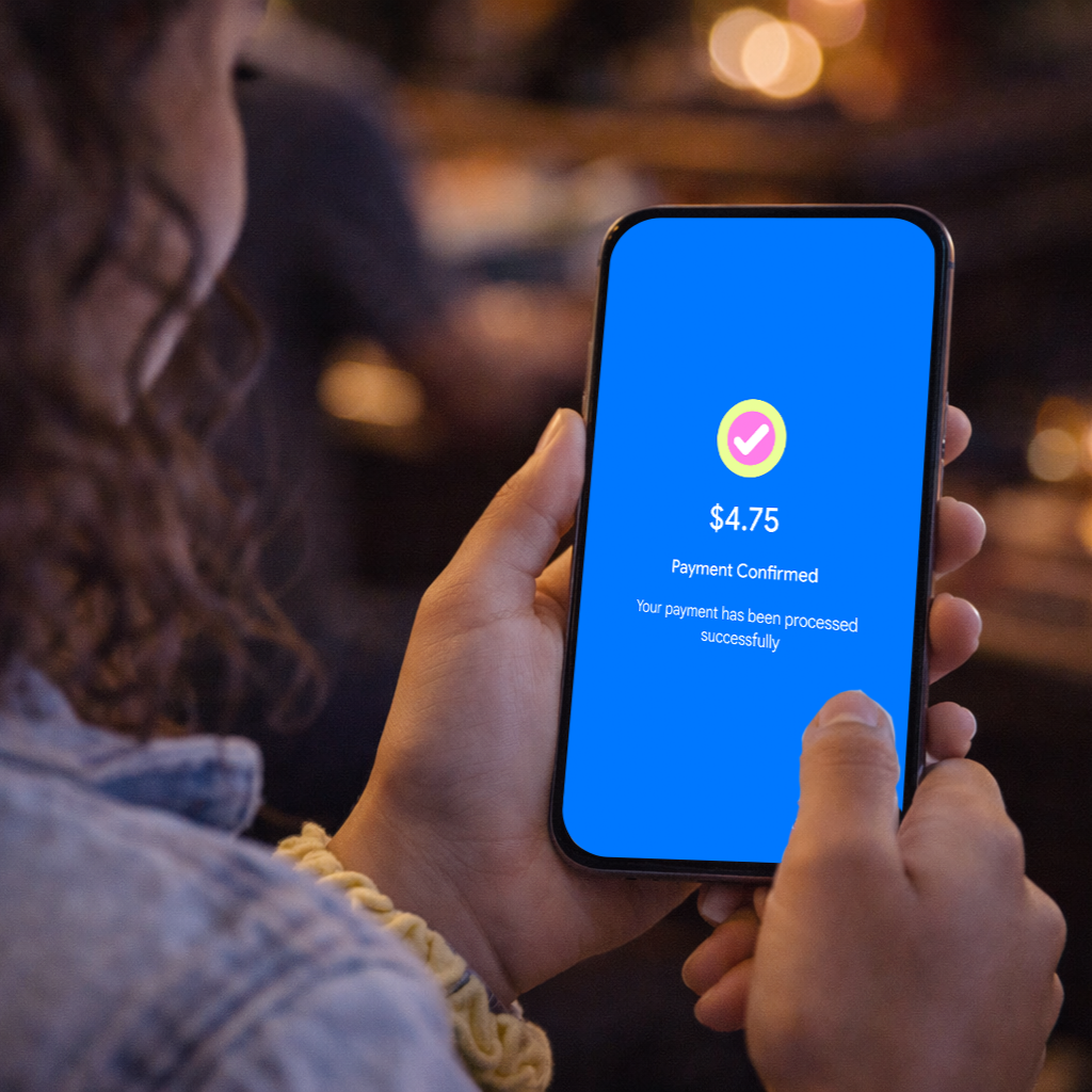
The app splits the fare automatically. No awkward Venmo requests required.
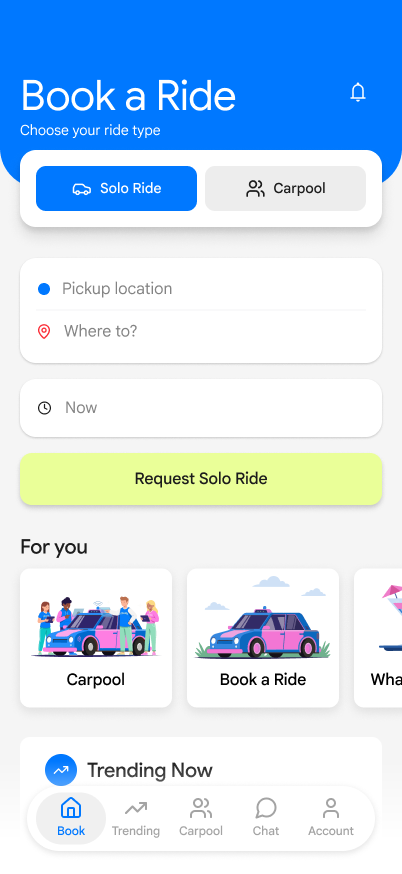
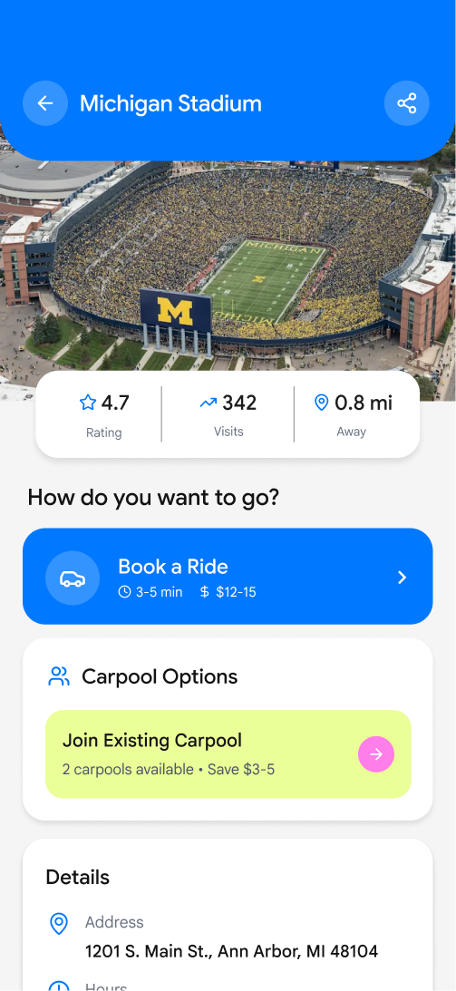
Version 1
3 out of 5 users struggled to locate where to start booking a ride. Users didn’t recognize booking as the primary action because it was visually buried by secondary content.
“I’m not sure where to book the ride.”
06 - User TestingTask: Book a ride to campus
Version 2
I made booking the primary action by surfacing it at the top of the home screen and introducing clear ride options (solo vs. carpool) and removed some of the secondary content.
Final Version
Users were overwhelmed by choosing between ride types too early, so I simplified the flow to focus on destination first.
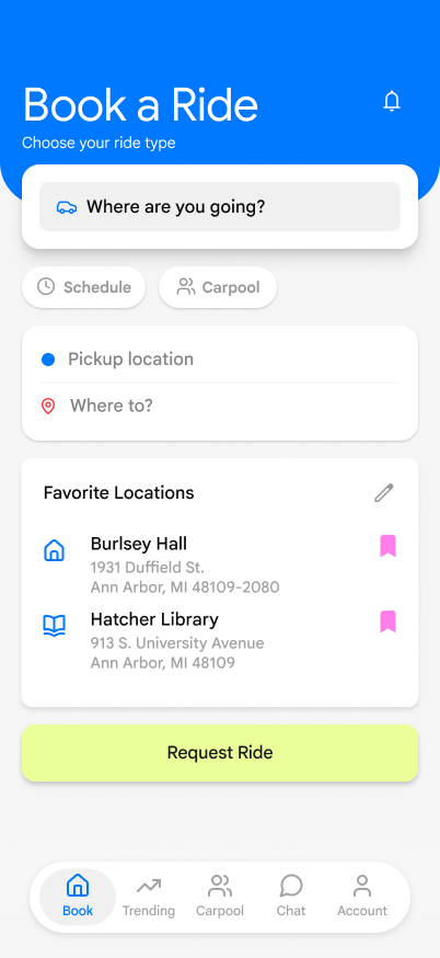
Made “Book ride” function more prominent on the homescreen
Removed ride-type decision to reduce cognitive load
Removed unnecessary secondary content
Task: Find the most popular bar and start a carpool
Version 1
4 out of 5 users hesitated or second-guessed their actions when trying to start a ride.
“There’s a lot here… I don’t know where to actually book.”
Users expected a clear “Book Ride” action but felt overwhelmed by the amount of location content and competing elements.
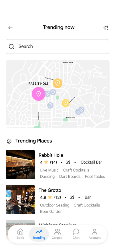
final version
I introduced more prominent “Book Ride” CTAs directly within location cards and reduced non-essential information. I also added filters to help users quickly narrow down popular spots.
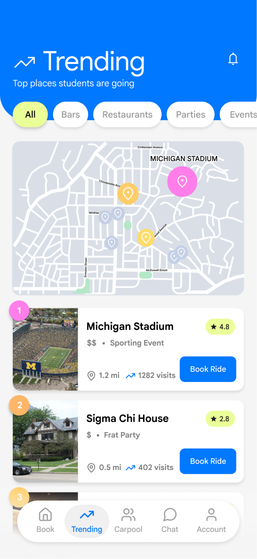
Removed unnecessary info & linked to google
Added clear “Book” CTA buttons
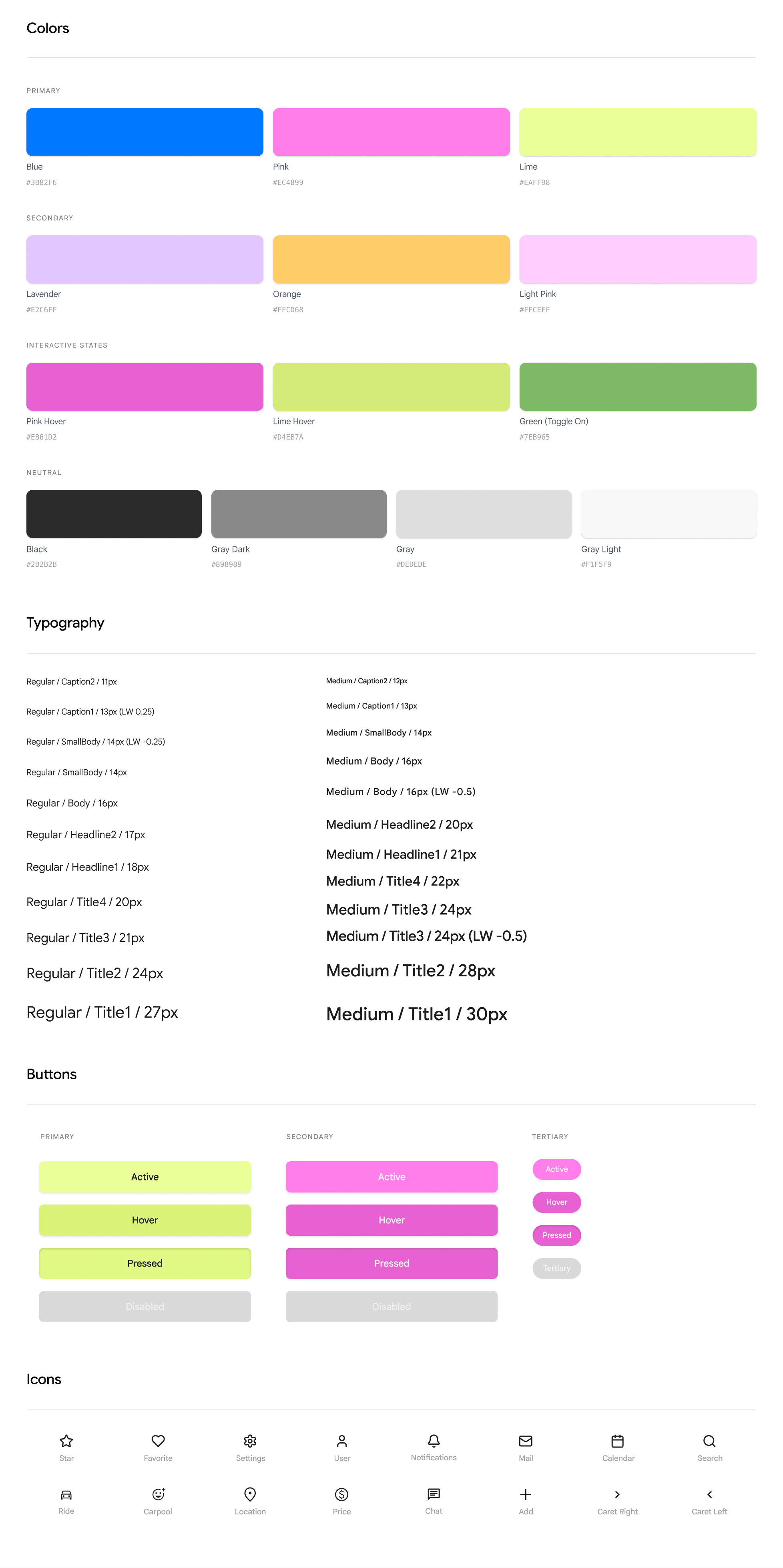
Collectiv Design System