From Audit to Redesign: Rebuilding Envirolite's E-Commerce Experience
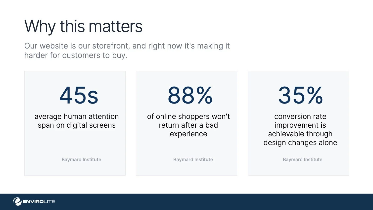
As the in-house designer at Envirolite, I had a unique vantage point into how the website was serving and failing its users. I took on a self-directed redesign initiative, conducting a UX audit and proposing strategic improvements to the site's information architecture, trust signals, and conversion flow.
ScopeUX Research · UI Design · Shopify Dev
companyEnvirolite · Troy, Michigan
toolsFigma · Shopify · Claude Code
01 - User PersonasWho’s buying foam?
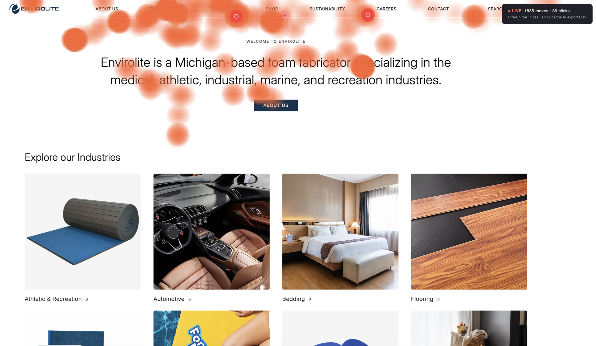
Envirolite serves vastly different buyers through one website, from gymnastics facility owners ordering custom pit cubes to hospital supply managers sourcing surgical positioning products. Understanding these users reveals why a one-size-fits-all navigation doesn't work.
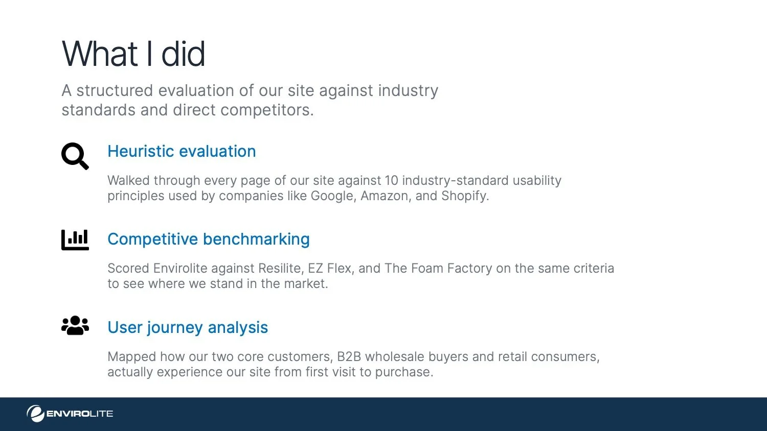
02 - heuristic EvaluationA heuristic evaluation to quantify the problem
I began with a heuristic evaluation using Jakob Nielsen's 10 usability heuristics as my framework. The goal was to move past subjective gut reactions and systematically identify where the experience breaks down and more importantly, to quantify the severity of each issue so I could prioritize what to fix first.
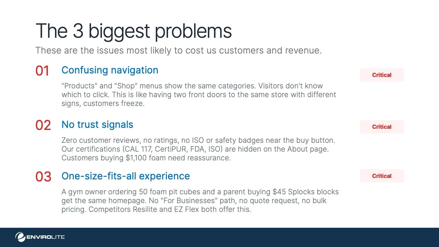
Major issues uncovered
The UX audit revealed 8 high-to-medium severity issues directly impacting conversion, trust, and user retention across all buyer segments.
04 - Behavioral AnalysisHeatmap Testing & User Interaction Insights
Before proposing changes to the site’s information architecture and navigation, I wanted to understand how real users were interacting with the existing experience. Rather than relying solely on heuristic evaluation or subjective critique, I conducted a behavioral analysis using a custom heatmap testing script.
To do this, I used Claude Code to generate a lightweight script that could be implemented directly within the Shopify theme’s Liquid file, allowing interaction data to be captured without introducing third-party tooling.
Key Findings
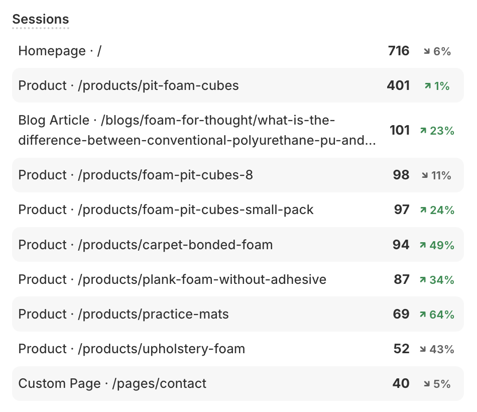
The heatmap analysis paired with Shopify analytics revealed several important behavioral patterns:
Most users were navigating immediately to Products, which includes all shoppable and non-shoppable products. Does this make Shop obsolete?
Unexpectedly high engagement appeared around Capabilities, indicating that visitors were actively trying to understand what Envirolite does and the scope of services or expertise offered.
Insight
These behavioral insights became a critical foundation for the next phase of the redesign, restructuring the information architecture and navigation to better align with user intent, clarify pathways, and reduce friction in the decision-making process.
05 — nav barCard sorting information architecture
I started with card sorting to make sense of the information architecture. The current site has two separate navigation sections "Products" and "Shop" that contain largely the same categories with overlapping SKUs, which creates confusion about where a user should go to find what they need.
The recommended structure consolidates everything into a single "Products" section organized by industry. Instead of dumping 20 flat product links under a category like Medical, I introduced intermediate sub-groupings: Positioning & Support, Surgical Accessories, Protection & Comfort, so users can scan and orient themselves faster without being overwhelmed by a wall of SKU names.
The same logic applies across verticals: Athletic & Recreation breaks down into Carpet Bonded Foam, Pit Cubes & Covers, Mats & Padding, and Accessories rather than listing every individual product in the mega-menu.
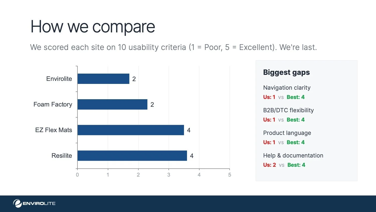
06 — benchmarkingCompetitive Matrix
I evaluated Envirolite’s top competitors using the same heuristic framework to identify common industry patterns, strengths, and gaps.
One recurring pattern I noticed was that many competitors clearly communicate product backorder status and lead times. Implementing this on Envirolite’s site could significantly improve the customer experience while also reducing the volume of sales inquiries related to product availability and shipping timelines.

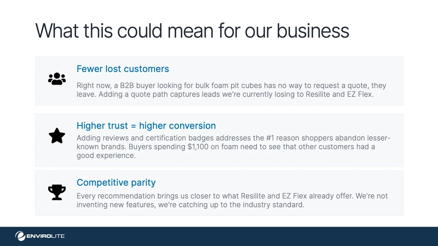
07 — the pitchPresenting to stakeholders
With findings in hand, I built a presentation to pitch the navigation consolidation and IA restructuring to leadership, framing every recommendation around customer impact and revenue, not design theory.

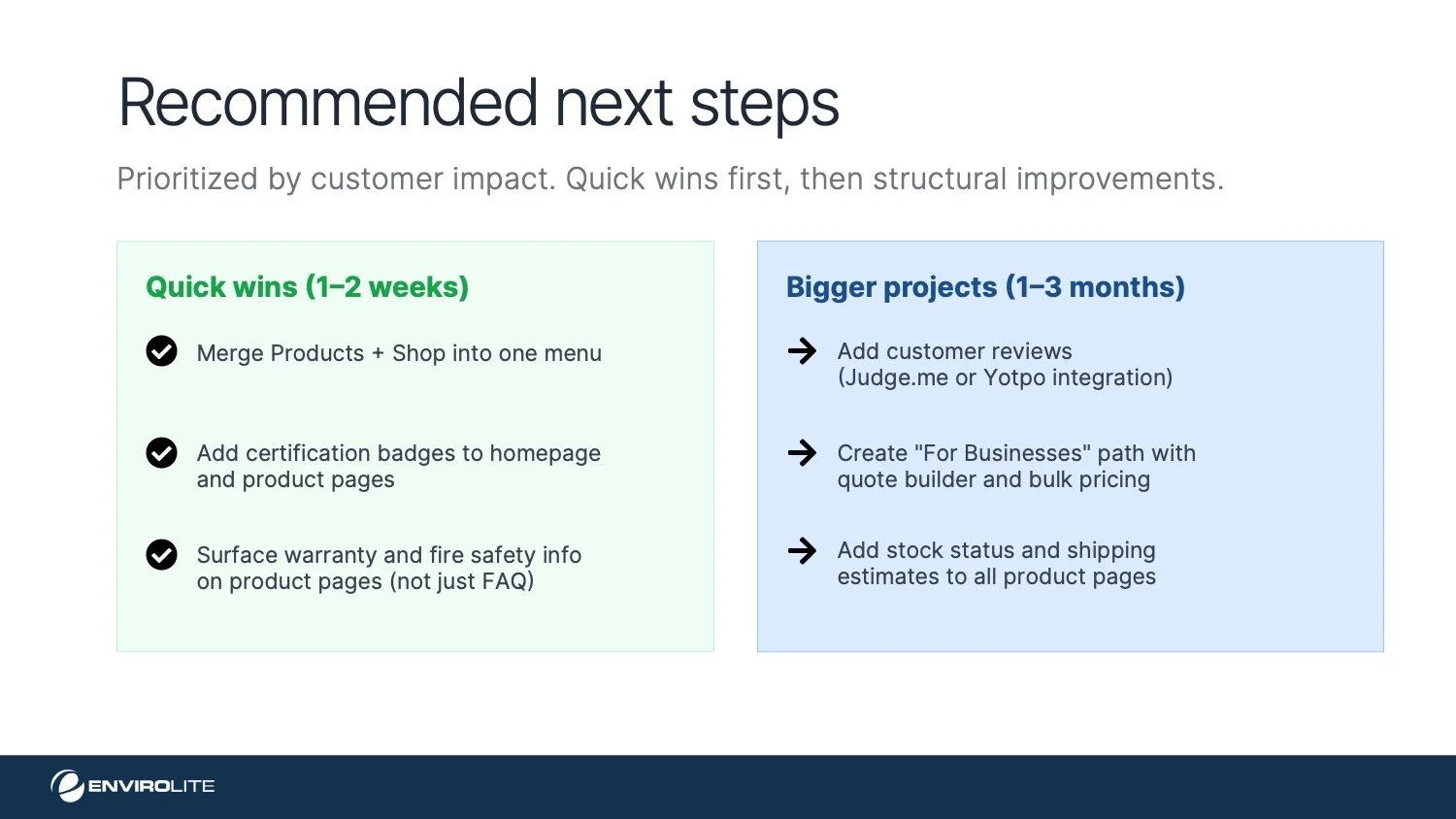
The Redesign
Navigation: before & after
before
after
Filtering options
We introduced relevant filters by product type and tagged each item accordingly.

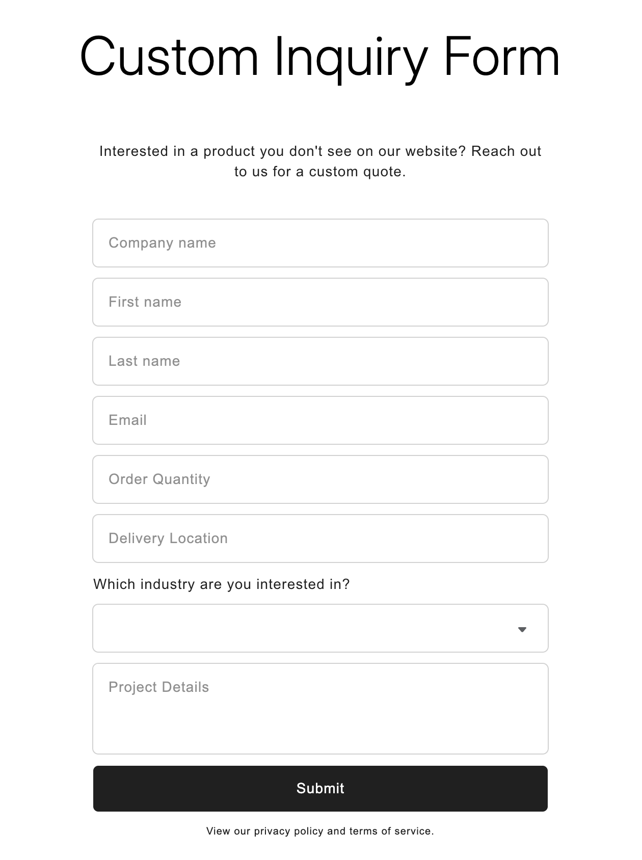
Custom inquiry form
Designed a custom inquiry form so B2B buyers can request bulk pricing or custom cuts directly on-site, eliminating the friction of composing a separate email that often gets abandoned before it's ever sent.
Added trust signals
Added FDA and ISO trust badges to the homepage to strengthen brand credibility and increase customer trust.
Integrated Judge.me to automate customer review requests and imported existing Amazon reviews to establish social proof early on.

